
10 Web Design Trends to Help You Stay Ahead of the Curve
In today's fast-paced digital landscape, staying ahead of the curve is crucial for web designers and businesses alike. The world of web design is constantly evolving, with new technologies, user preferences, and industry standards shaping the way websites are created and experienced. To ensure your online presence remains relevant and captivating, it's essential to keep up with the latest trends.
Research has shown that embracing the latest web design trends can have a significant impact on user engagement and business success. According to a study conducted by Adobe, 38% of website visitors will stop engaging with a website if the content or layout is unattractive. Furthermore, 66% of consumers prefer to engage with beautifully designed websites over plain and simple ones, as revealed by a survey conducted by Tyton Media.
By staying updated with the latest trends and implementing them effectively, you can create websites that not only impress but also deliver exceptional user experiences. These trends are not merely fleeting fads but are backed by research and industry insights. They have proven to enhance user engagement, increase conversions, and ultimately drive business growth.
In this post, we'll explore the new trends that are revolutionizing web design and examine how they can help you create captivating online experiences for your target audience. By incorporating these trends into your website’s design, you can better position your business, set yourself apart from the competition, and captivate your target audience.
10 Web Design Trends to keep in mind this year
Website design trends are constantly evolving, and staying ahead of the curve requires paying attention to what's new and innovative. Here are some of the latest trends in website design and tips for staying up-to-date:
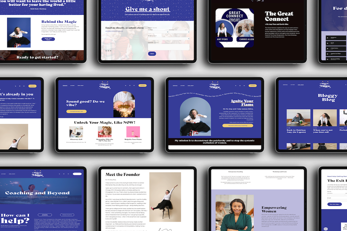
1. Minimalism
One notable trend that has had a profound impact on the world of web design is minimalism. As the world becomes more digital, I believe minimalism will become even more popular.
We can’t talk about minimalism without mentioning Apple. Renowned for its sleek and minimalist approach, Apple has mastered the art of creating visually stunning and user-friendly interfaces.
Apple's website exemplifies the power of minimalism in web design. With its clean layout, ample white space, and focus on essential elements, Apple creates a sense of elegance and sophistication. By stripping away unnecessary clutter and distractions, they allow the user's attention to be solely on the key information and products they offer.
The use of generous white space not only enhances the overall aesthetics but also improves readability and visual hierarchy. Each element on the page has room to breathe, ensuring that the user's focus is directed to the most important elements. Additionally, Apple's choice of typography is carefully selected, with clear and legible fonts that create a sense of clarity and professionalism.
By adopting a minimalist design approach, Apple achieves a seamless and intuitive user experience. Navigation is simplified, and the user is guided effortlessly through the website, creating a sense of ease and efficiency. This approach has undoubtedly contributed to Apple's success, as users are able to engage with their products and brand in a visually appealing and straightforward manner.
Apple's minimalist design philosophy has influenced countless designers and continues to shape the industry. Its ability to communicate elegance, simplicity, and functionality through web design serves as a powerful example of how less can indeed be more. By embracing minimalism and taking cues from Apple's approach, web designers can create visually impactful and user-centric websites that leave a lasting impression.

Renowned for its sleek and minimalist approach, Apple has mastered the art of creating visually stunning and user-friendly interfaces.
2. Mobile-First Design
Mobile-first design has become an essential aspect of modern web design, driven by the increasing use of mobile devices. Today, a majority of visitors come to your website on mobile. Prioritizing the mobile user experience is crucial for reaching and engaging with a wider audience. Plus it helps build engagement and metrics on your website.

It’s important to prioritize the mobile user experience is crucial for reaching and engaging with a wider audience. You can make a link page like this one on your website for social media visitors, who are most likely viewing your website on mobile.
In an era where mobile devices dominate web traffic, designing with a mobile-first mindset has become essential. Starbucks serves as an exemplary model, demonstrating how mobile-first design principles can drive user engagement, improve usability, and contribute to business success in the digital landscape.

By prioritizing the mobile user experience through responsive design, performance optimization, touch-friendly interactions, and app integration, Starbucks showcases the power of mobile-first design.
When visiting the Starbucks website on a mobile device, it becomes evident that they have carefully considered the unique needs and behaviors of mobile users. The website employs responsive design techniques, automatically adapting its layout and content to fit different screen sizes. This ensures that users can easily navigate and interact with the site, regardless of the device they are using.
By prioritizing the mobile user experience through responsive design, performance optimization, touch-friendly interactions, and app integration, Starbucks showcases the power of mobile-first design. Their approach ensures that users have a consistent and enjoyable experience, regardless of the device they choose to engage with.
3. Microinteractions
Microinteractions, which encompass small and subtle animations and interactive elements, play a significant role in enhancing user engagement and improving the overall user experience. These delightful details can range from hover effects and button animations to scrolling animations and more. An excellent example of a website that utilizes microinteractions effectively is Dropbox.
When you visit the Dropbox website, you'll notice various microinteractions that make the browsing experience engaging and interactive. One prominent example is the hover effect on the "Sign Up" CTA (Call-to-Action) button. As you move your cursor over the button, it subtly animates with a slight color change or transition, indicating interactivity. This small visual feedback provides a sense of responsiveness and encourages users to take action.
Dropbox employs microinteractions when interacting with file previews. When you hover over a file thumbnail, you may notice subtle animations like zooming or shadow effects, giving a visual cue that the file is clickable or interactable. These microinteractions make the browsing experience feel more dynamic and interactive, contributing to a sense of delight and engagement.

Another instance of microinteractions on the Dropbox website can be seen when scrolling through the page. As you navigate the content, certain elements may animate or fade in, adding visual interest and guiding your attention. These scrolling animations create a smooth and enjoyable browsing experience, keeping users engaged and encouraging them to explore further.
By incorporating microinteractions strategically, Dropbox has successfully transformed their website into an interactive and engaging platform. These small animations and interactive elements add an extra layer of interactivity and feedback, making the user experience more enjoyable and memorable.
Microinteractions, such as hover effects, button animations, and scrolling animations, offer an opportunity to captivate users and enhance their overall engagement. Dropbox's implementation of microinteractions serves as an exemplary model, showcasing how these subtle details can elevate the user experience and contribute to a more interactive and immersive website.
4. Bold Typography
Bold typography has become a popular trend in web design, allowing websites to make a strong visual impact and effectively communicate their brand's personality. A noteworthy example that showcases the power of bold typography is the website of Spotify, the renowned music streaming platform.
In the realm of web design, bold typography has emerged as a compelling trend that allows websites to communicate effectively, leave a memorable impression, and establish a strong visual identity. Spotify's implementation of bold typography serves as an inspiring example, demonstrating the impact that well-executed typography can have on the overall user experience and brand perception.

Spotify incorporates bold typography alongside data visualizations striking a balance between graphical representation and textual information in it’s year-end Spotify Wrapped.
Spotify Wrapped has become an annual tradition for music lovers, providing personalized insights into their music listening habits over the past year. One striking aspect of these reports is the prominent use of bold typography. Incorporating bold typography alongside data visualizations strikes a balance between graphical representation and textual information. The bold headings and labels complement charts and graphs, providing context and clarity to the data presented. This combination of typography and visual elements ensures a comprehensive understanding of the music insights.
Bold typography evokes a sense of visual impact, enhancing the emotional engagement of users with their music data. The use of bold fonts to display favorite songs, artists, and genres creates a sense of excitement and pride in users, encouraging them to share and celebrate their musical tastes.
5. Sustainable Web Design
As environmental consciousness grows, sustainable web design practices are gaining traction. Optimizing energy usage, reducing data waste, and using eco-friendly hosting services are becoming key considerations for responsible web development.

GreenGeeks is a web hosting provider that is committed to being carbon-neutral and actively works to reduce their environmental impact. For every unit of energy they consume, they invest in wind energy to offset three times that amount.
Energy consumption is a significant factor in the environmental impact of websites. Sustainable web design involves optimizing the use of resources to minimize energy consumption. Techniques like compressing images and files, using efficient code, and implementing server-side caching all contribute to reduced energy usage and faster-loading websites.
The choice of web hosting services plays a crucial role in sustainable web design. Opting for eco-friendly hosting providers that use renewable energy sources, such as wind or solar power, significantly reduces the carbon footprint associated with website hosting. Many hosting companies now offer green hosting plans to cater to environmentally conscious clients.
GreenGeeks is a web hosting provider that operates on renewable energy. They are committed to being carbon-neutral and actively work to reduce their environmental impact. For every unit of energy they consume, they invest in wind energy to offset three times that amount.
6. Illustrations + Custom Graphics
The use of custom illustrations and graphics can help create a unique and memorable brand identity, as well as add visual interest and enhance storytelling.
Custom illustrations and graphics offer a brand the opportunity to stand out in a crowded market. By commissioning artwork that aligns with the brand's values, personality, and messaging, businesses can create a visual identity that is distinct, recognizable, and difficult to replicate. This uniqueness helps to differentiate the brand from its competitors, fostering a lasting impression in the minds of consumers.
Some brands deal with abstract or complex concepts that are challenging to convey through conventional imagery. Custom illustrations and graphics offer a creative solution to visualize these ideas, simplifying complex information and making it more accessible and understandable for the audience.

The custom illustrations used by Slack create a unique and cohesive visual identity, helping the brand stand out in a competitive market.
Consumers often respond positively to authenticity. The use of custom illustrations and graphics communicates that the brand has invested time and effort in crafting a unique identity. This attention to detail fosters trust, as consumers perceive the brand as being committed to providing a unique and high-quality experience.
The custom illustrations used by Slack create a unique and cohesive visual identity, helping the brand stand out in a competitive market. They align with Slack's overall messaging of promoting teamwork, productivity, and a positive work environment. These illustrations also contribute to making the user experience more enjoyable and approachable, reflecting the brand's user-centric approach.
Slack's custom illustrations are designed to represent various aspects of the platform's functionality and features. These illustrations often showcase characters interacting in different scenarios, representing the diverse users and teams that benefit from using Slack. The illustrations are colorful, fun, and engaging, adding a touch of personality to the brand.
7. Asymmetrical Layouts
Asymmetrical layouts have emerged as a striking departure from traditional grid-based designs. Embracing asymmetry, these layouts introduce a sense of creativity and uniqueness to websites, pushing the boundaries of visual composition. By incorporating overlapping elements and varying proportions, asymmetrical layouts create a captivating and dynamic user experience.

The website of Future London Academy uses an asymmetrical layout to present information about their design courses and events. The off-centered alignment and overlapping sections create a sense of dynamism and innovation.
The website of Future London Academy uses an asymmetrical layout to present information about their design courses and events. The off-centered alignment and overlapping sections create a sense of dynamism and innovation. The off-centered alignment and overlapping sections create a dynamic and innovative visual presentation that reflects the academy's dedication to providing exceptional design courses and events. By embracing asymmetry, Future London Academy showcases creativity, establishes a unique brand identity, and offers users an unforgettable journey through their world of design education and inspiration.
8. Neumorphism + Soft UI

Neumorphism and Soft UI share common ground in their pursuit of visually engaging interfaces with a focus on depth and realism. While Neumorphism tends to embrace a more pronounced and skeuomorphic appearance
Both of these design approaches strive to create visually appealing and user-friendly interfaces by incorporating depth and realism. Neumorphism combines elements of skeuomorphism and flat design, creating a soft, three-dimensional appearance that mimics physical objects. Soft UI focuses on using subtle shadows, layers, and gradients to provide depth and enhance usability.
Neumorphism and Soft UI share common ground in their pursuit of visually engaging interfaces with a focus on depth and realism. While Neumorphism tends to embrace a more pronounced and skeuomorphic appearance, Soft UI takes a more subtle and refined approach. However, both styles are united in their desire to enhance the user experience and create interfaces that feel familiar and tangible.
Neumorphism and Soft UI represent two captivating design styles that have emerged in the digital realm. By combining elements of skeuomorphism and flat design, Neumorphism creates a soft, three-dimensional aesthetic, evoking a sense of tangibility and familiarity. On the other hand, Soft UI leverages gentle shadows, layers, and gradients to strike a balance between minimalism and depth, resulting in visually pleasing and user-friendly interfaces. Both approaches are driven by the desire to enhance the user experience, bridging the gap between the real and digital worlds and transforming interactions into a delightful and engaging journey.
9. Voice User Interface (VUI)
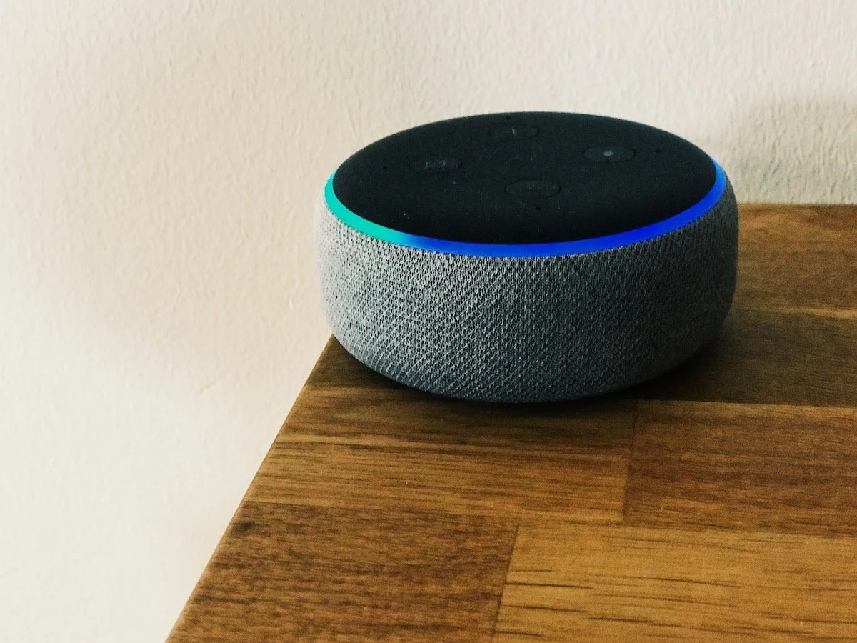
With its popular voice assistant, Alexa, Amazon has seamlessly integrated voice commands into its website, allowing users to access products, track orders, and manage their accounts using just their voice.
Designing websites to be voice-activated opens up a plethora of benefits for both users and businesses. Firstly, it enhances accessibility, catering to individuals with mobility impairments or visual limitations, providing them with a seamless browsing experience. Secondly, voice interactions offer greater efficiency, allowing users to quickly find information, make purchases, or engage with content without the need for traditional manual input.
One of the most significant applications of voice-enabled website design is in the realm of e-commerce. By integrating voice commands into the shopping process, users can effortlessly search for products, add items to their carts, and complete transactions with minimal effort. This frictionless experience not only boosts user satisfaction but also drives conversions for businesses.
As a trailblazer in the voice assistant market, Amazon has pioneered the integration of voice technology into its services. With its popular voice assistant, Alexa, Amazon has seamlessly integrated voice commands into its website, allowing users to access products, track orders, and manage their accounts using just their voice. This approach has set the standard for voice-activated e-commerce experiences.
10. Accessibility-First Design
Accessible web design caters to a broad spectrum of users, including those with visual, auditory, cognitive, and motor impairments. By implementing features like text alternatives for images, captions, and transcripts for multimedia content, keyboard navigation, and easy-to-read fonts, websites become more accessible to a wider audience.
Web accessibility is not just a matter of best practice; it is also a legal requirement in many countries. Laws such as the Americans with Disabilities Act (ADA) in the United States and the Web Content Accessibility Guidelines (WCAG) internationally mandate that websites be accessible to all users. Failure to comply with these regulations can result in legal consequences and damage to a brand's reputation.

The A11Y Project is an initiative that advocates for web accessibility and provides a wealth of resources for developers, designers, and content creators.
The A11Y Project is an initiative that advocates for web accessibility and provides a wealth of resources for developers, designers, and content creators. Their comprehensive guidelines, checklists, and tools help individuals understand and implement accessible practices in their web projects, fostering a more inclusive digital environment.
Staying ahead of the curve is a continuous process that requires adaptability and a keen eye for emerging trends. Throughout this blog post, we have explored the latest research-backed trends that are reshaping the web design landscape. By embracing these trends and incorporating them into your design process, you can create websites that not only captivate your audience but also deliver exceptional user experiences.
Remember, research has shown that attractive and well-designed websites have a significant impact on user engagement and can influence consumer behavior. By staying updated and implementing these trends effectively, you can create a competitive advantage for your business.
However, it's important to note that while trends provide inspiration and guidance, they should not overshadow the fundamentals of good web design. Accessibility, usability, and a focus on user needs should always be at the forefront of your design decisions.
As you embark on your web design journey, keep an open mind and stay curious. Continually seek new ideas, experiment with innovative techniques, and adapt to the evolving needs and preferences of your target audience. By staying informed and proactive, you can ensure your web designs remain fresh, relevant, and compelling in this ever-evolving digital landscape.
Need help redesigning your website? We have a workbook for you with step-by-step instructions on redesigning your website. Download the free workbook by clicking the button below.
Have an upcoming website redesign project? We’d love to help you out. Get in touch with us by clicking the button below.