
The Anatomy of a Winning Homepage Design
the 9 Key Components to Have on Your Homepage to drive engagement
Like a well-designed storefront, the homepage of your website sets the tone for what visitors can expect from your brand. A strategically designed homepage has the power to leave a lasting impression and foster meaningful connections with users. A poorly designed homepage can cause users to leave your website confused and unable to remember your brand.
A research report by the Stanford Persuasive Technology Lab found that 46.1% of people say a website’s design is the number one criterion for judging the credibility of a company.
As a website designer and longtime marketer, I can tell you that your homepage is almost always the number one most-viewed webpage of any website. Your homepage is also the place where users can find links to dive deeper into your website.

Here’s a website we recently designed + launched for a coffee shop in a historic farmhouse.
From the hero header banner that captures attention and communicates the core message to the clear navigation menu that guides users on a seamless exploration, every element on your homepage plays a vital role. Staying updated on best practices and trends is important to creating a compelling and user-centric homepage. To help, we’ve put together key elements to include on your home page, backed by our research and experience.
1. SIMPLE Navigation Menu
Your main navigation menu is the backbone of your site, acting as a roadmap for visitors to find their way around your website. It serves as a tool for ensuring a seamless user experience and lets users access information quickly and effortlessly.
A clear navigation menu begins with simplicity. Avoid overwhelming users with a plethora of options. Instead, focus on displaying essential categories and keep the menu uncluttered. Ensure consistent placement of the navigation bar across all pages.
According to Nielsen Norman Group, web users spend 80% of their time viewing the left half of the page and 20% viewing the right half. By placing the logo on the top left, you can take advantage of users' visual scanning patterns. This strategic placement ensures that the logo is the first element users see, which helps establish brand recognition and familiarity.

Apple’s Simple Navigation Menu
Apple’s website has a simple navigation menu. The logo is in the top left corner of the screen. The menu is simple, but easy to use.
This menu also pops up and takes over the screen. This allow the user to focus on the items on the menu.
2. Compelling Hero Banner
At the top of your home page, you should greet your users with a captivating hero header banner that grabs the user’s attention. Your brand messaging should convey the values you bring to your customers and set the tone for the rest of your website.
A lot of brands make their hero banner all about themselves. But we find that users like brands that show they care and understand their user’s pain points. You should develop messaging that shows off users’ pain points, while also showing how your brand is the solution.

Doctors Without Borders Hero Banner
Doctors Without Borders is an internationally-known organization that provides independent medical assistance to where it’s needed most. On their hero banner, they bring awareness to world issues they are fighting for.
3. Emphasize your mission + what you Do
Your homepage needs to clearly tell people what your brand does. You want users to immediately understand what you do and how you're unique. You should work on writing a compelling narrative and creating stunning visuals to show the driving force behind your mission, core values, and the solutions you provide for customers.
This section should be at the top of your homepage and, preferably, right after your hero banner to make sure users understand what you do. I would recommend linking to your about us page from this section, but you might have a better place for it.

charity: water What We Do Section:
On charity: water’s homepage, they have a great section that breaks down their mission with research findings. The section also has custom icons next to the research findings. I like how this grabs your attention and also helps explain their mission and vision.
This section is located right after the hero banner on their website so it’s sure to be seen by most visitors.
4. Showcase your Products + Services
Towards the top of your homepage, you should showcase your services and products so people know what you specifically do. Through a blend of icons and photos, you give a visual representation of the services and products you offer customers. Whether it's digital solutions, consulting, or innovation, your service area section should help give users a look into what you specifically can do for them.
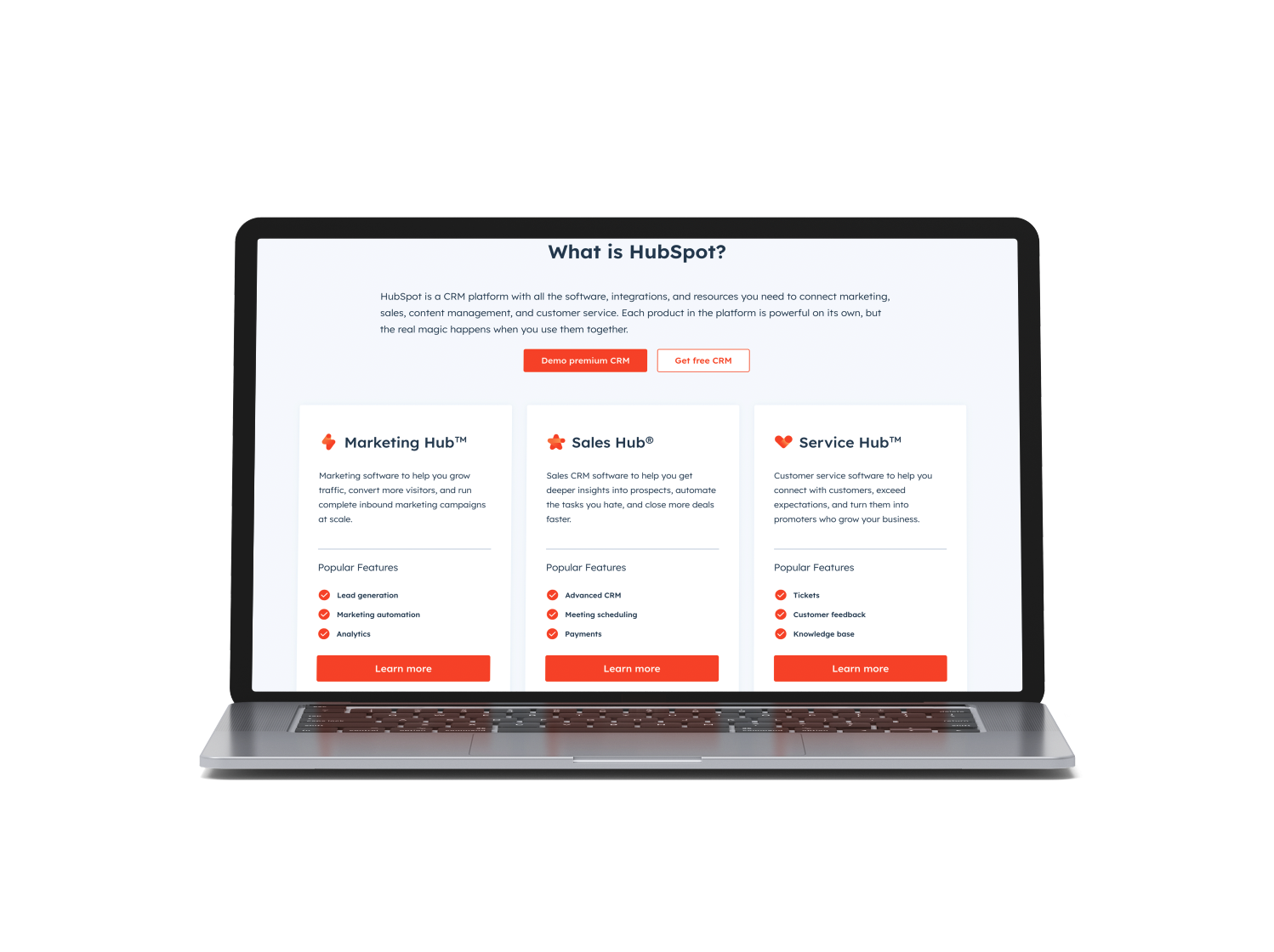
HubSpot Service Section
HubSpot has a great homepage that has links to all it’s resources and services. At the top of the homepage, HubSpot has a great section that explains what HubSpot is by breaking down the service hubs the app has.
5. ENGAGING INTRODUCTION VIDEO
Every homepage needs a video. Make sure you put a video that explains your brand and helps users understand how you help them.
Put your video towards the top of your homepage. Ideally, your video would be housed in the introduction section or right after the hero banner. This allows users to enter your website and immediately hear from you.
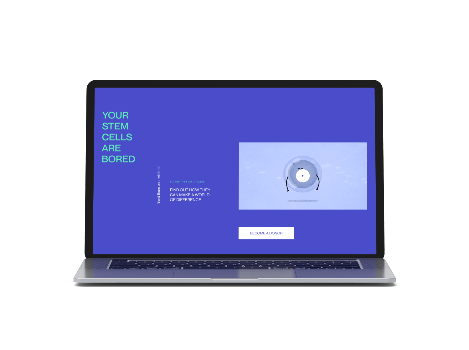
Swab the World’s Homepage Video
Swab the World’s homepage has an awesome explainer video that breaks down how you can help their unique cause. Their video is pretty high up on their page and opens up fullscreen when you click on it. I think this video is one of the most powerful part of their homepage. Here’s a link to the video too.
6. Testimonials THAT BUILD TRUST
Testimonials and reviews are key components on your homepage because they reinforce your messaging and help users trust your brand. You also can choose to have case studies on your homepage that link to detailed projects and solutions you’ve worked on.
When it comes to buying these days, users need social proof to help make an informed decision. Your website should have a spot for testimonials and/or case studies.
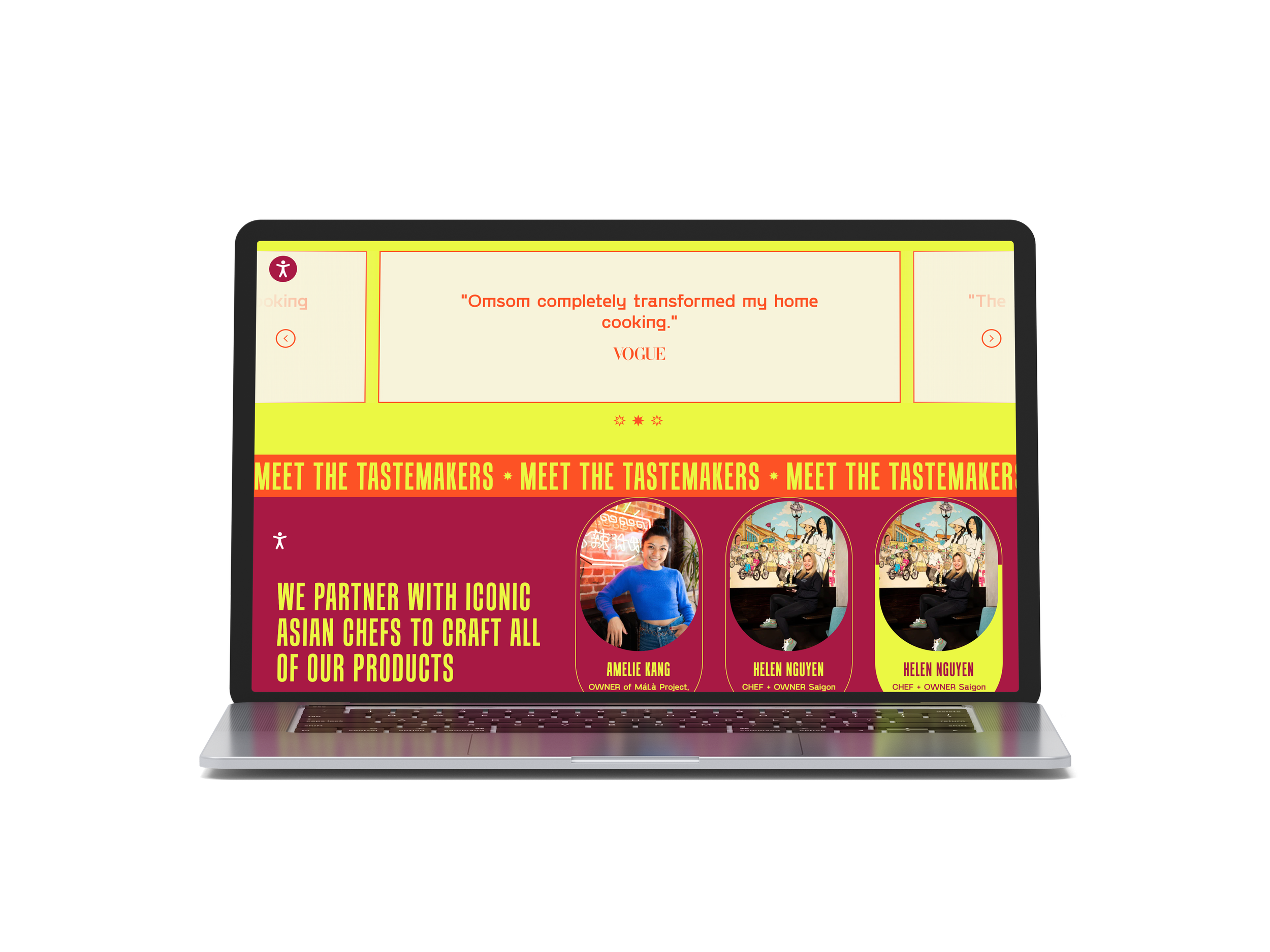
Omsom Testimonial Section
Omsom sells asian noodles with lots of flavor. Their homepage is a great representation of their brand because it’s bold and colorful. They also feature a scrolling testimonials section on their homepage that is bright and engaging.
7. VALUABLE Content + Resources
Let users find your content from your homepage. Add in a section that links to your blog, podcast, case studies, or whatever resource gallery you have. If you have a lot of resources, then feel free to have multiple sections on your homepage that link to resources.
You should link to informative and thought-provoking content, ranging from insightful blog posts and expert articles to engaging videos and podcasts. This will show users your commitment to sharing valuable content that empowers your audience with the trends, best practices, and industry news. If you don’t have much content, then use what you have as you build your resource library.
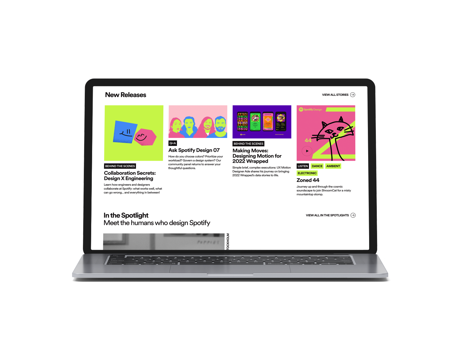
Spotify Design Homepage Resources
Spotify Design has a cool homepage with a ton of resources. You get to meet the people who design for Spotify and hear about their design choices. I like the minimal design of the website, but the bold use of graphics and illustrations to go with each resource.
8. CLEAR Call-to-Action
As you near the end of our home page, add a call-to-action so you can convert visitors into potential leads. Whether it's signing up for our exclusive newsletter, scheduling a consultation, or exploring our premium offerings, this CTA acts as the gateway to a transformative experience.

Call-to-Action Example
ACLU’s homepage has a great call-to-action at the very bottom of the page. It lets visitors select whether to give their contact information, sign up to make calls, join a volunteer team, or host an event. This allows for users to engage in a way that’s best for them.
9. INFORMATIVE Footer
Finally, the footer is often overlooked, but it still plays a big part in your homepage. Your footer serves as the finale to the user's journey through your homepage. Positioned at the bottom of every page, the footer is an essential space that can enhance user experience, provide vital information, and reinforce your brand identity.
Repeat important navigation links in the footer to provide users with an alternative method of accessing crucial pages, such as the home page, About Us, Services, and contact. This redundancy ensures visitors can effortlessly find what they are seeking, no matter where they are on your website.
You also can include a contact form and/or newsletter subscription form to your footer. I also recommend adding in social media links to give users another way to connect with your brand. You should also include links to your privacy policy and terms of service in the footer. This is crucial for maintaining transparency and complying with data protection regulations, fostering trust with your users.
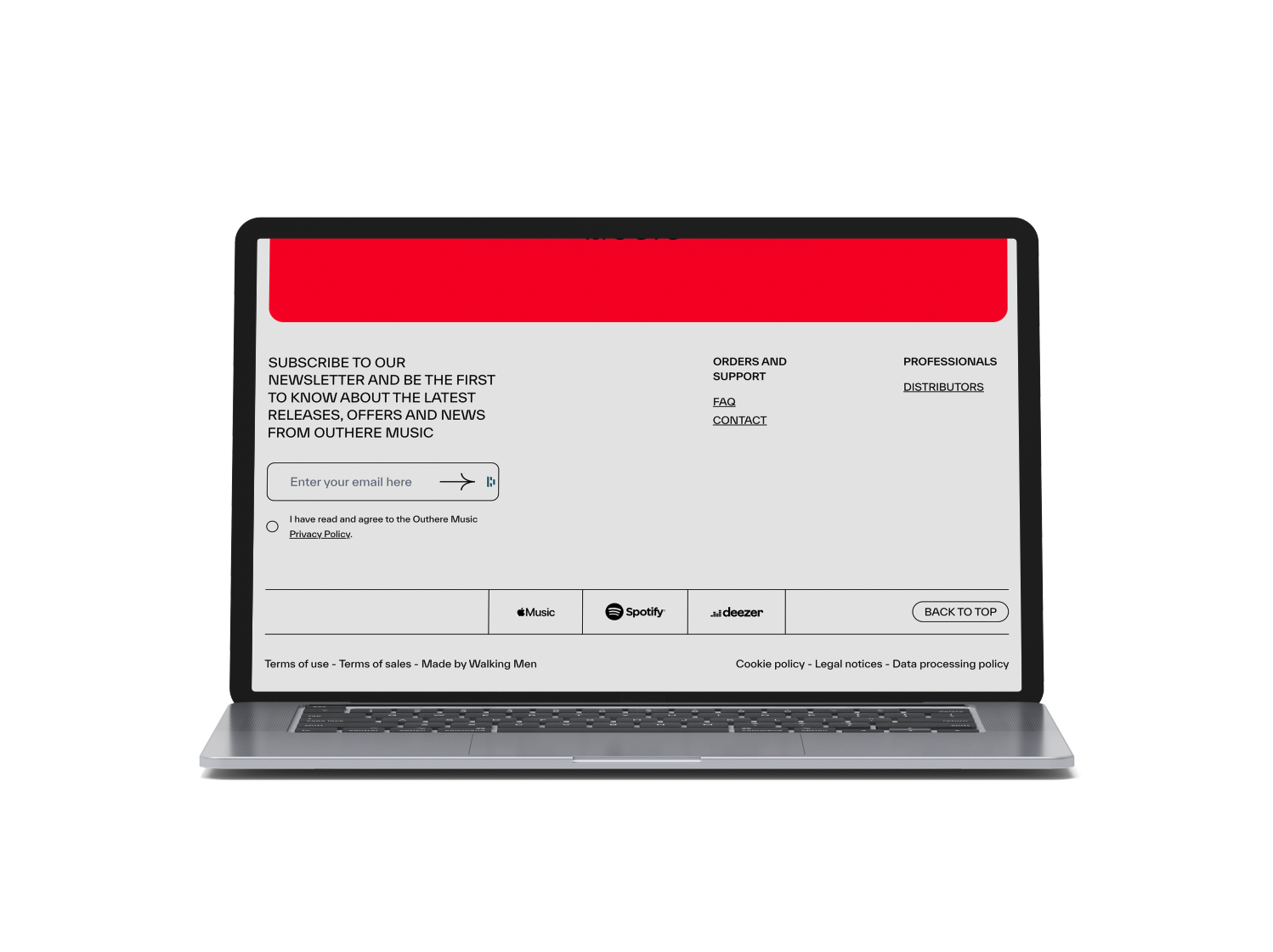
Out There Homepage Footer
On Out There Music’s homepageen, they have a beautiful and simple footer. I love how the lines break up and categorize this section. There are lots of links and places for visitors to explore the site further.
There are obviously more sections and things to include on your homepage. Depending on your industry and niche, you may need to have industry segments broken down on your website, or custom-coded sections. But I believe these nine components are key to a successful homepage design.
The power of a well-designed homepage lies not just in its ability to attract users but also in its potential to strengthen your brand’s identity and build authentic connections with your target audience.
Need help with a website design project? It can be an overwhelming experience and you might not quite know where to begin. To help, here’s a free website planning guide that will step you through the whole process. You can download it by clicking the button below and filling out the form.
Need help with your website? We would love to help. Get in touch with us today by clicking the button below.