9 WAYS TO MAKE YOUR WEBSITE VISUALLY STAND OUT
Your website is the most visible application of your brand. Your website is also vital in how people perceive your brand. Research shows that 46.1% of people say a website's design is the number one criteria for judging the credibility of a company. This means that the design of your website could be negatively affecting how people view your brand.
46.1% of people say a website's design is the number one criteria for judging the credibility of a company
The effective use of graphics on your website can immediately grab users attention, communicate to your audience what you stand for, and present your company’s personality. In addition, imagery SEO (search engine optimization) done right can boost your search engine rank and actually attract new organic visits to your website.
But like all things web, there is a right way to implement images on your website. Follow these tips when placing graphics on your website to better reach your audience and drive traffic and clicks:
1. Use authentic + PURPOSEFUL imagery
Web visitors should immediately know what your brand does and how it serves them as soon as they land on your website. Incorporating authentic and purposeful images on your website can help drive home your message and let users identify with your company. Be sure to select images that make the purpose of your brand apparent.
The best images to use on your website are images that you have taken of your products or services. Stock imagery often fails to adequately represent the unique value of a brand. Take photos yourself to use on your website. Consult with a graphic designer or photographer to help you create proprietary images that capture your value and purpose.
SAAM has a lot of great product photography that they use across their website and on social media posts. They took photos of their product then worked with a graphic designer to clean up images.
2. Use stock imagery carefully
Research shows that websites that use imagery with people in headers perform better. But not all brands have the time or budget for professional images.
Stock images can help fill your website with quality images that help with conversions. But many companies overdo it with stock images and select images that don’t authentically capture their brand. Too many stock photos can cause users to lose trust in a brand. Generic stock imagery of people interacting, for example, turns users off to your site and doesn’t say anything about who you are.
If you can’t find a stock image that captures your business, look for images that relate to your target personas instead. Industry and application photos can help web visitors understand that you work in their industry and are specialized in helping solve their unique problems.
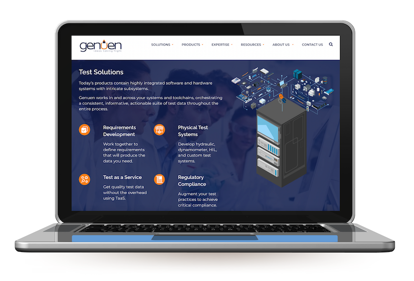
Below is a graphic of a test stand that I designed for Genuen’s homepage. The background image on this module is actually a stock photo with a dark blue overlay. I carefully designed this module to showcase Genuen’s custom test solution offerings while also using people in the background to make the design seem more authentic.
I designed this graphic of a custom test stand for Genuen’s homepage. This graphic shows the system integration and customization offerings that Genuen can do for clients.
Some resources I suggest for finding great stock images are stock.adobe.com, istockphoto.com, and gettyimages.com. I also use Canva Pro’s images often.
3. icons increase usability
Icons have played a role in software for many years as a way to visually cue users to perform a task. But they also provide an effective way to offer your web visitors choices when there are many options. Web usability studies have pointed to higher bounce rates when visitors are faced with too much text, especially when making drill-down choices.
Here are icons that I created for SASE Creative. These icons bring in brand personality while also capturing meaning.
I suggest using thenounproject.com and fontawesome.com for your icon needs.
4. INFOGRAPHICS INCREASE READABILITY
According to the University of Minnesota, the human brain can process images up to 60,000 times faster than text. Your eyes tend to linger on images more than text because images are easier to process than text. Why not incorporate more graphical elements within your body text to facilitate scanning and quick comprehension of content?
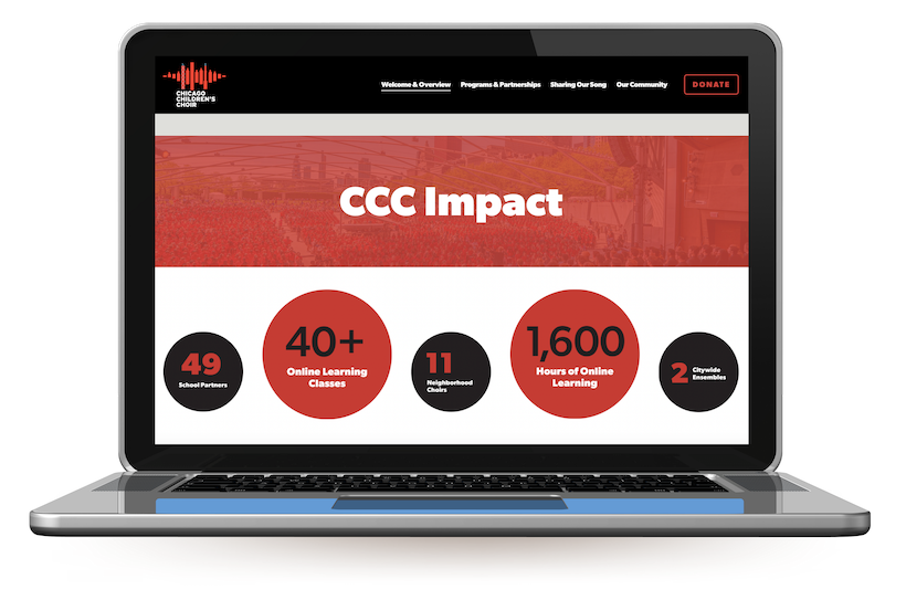
CCC’s 2021 Annual Report website incorporates statistics and graphical bullets on its homepage to break up text and draw visitors in.
See how CCC makes data points stand out on their website so visitors can easily read the content.
5. Brand patterns bring cohesiveness to websites
Using brand patterns or background images on websites is something that I love to do to make a website custom to a brand. You can create your pattern using imagery/icons from your logo and branding. You also can create a new pattern with brand shapes or industry-specific graphics.
Below is a custom brand pattern that I created for TREW Marketing. TREW’s whole website used electronic board patterns to show that they are a technical marketing agency. When I designed TREW’s website, we had trouble finding stock images that showcased technical marketing, so we chose to use a brand pattern instead. This pattern is designed with mostly circles and lines carefully balanced together.
6. Videos
Videos have helped brands increase web traffic by 87% according to Wyzowl’s annual research on video marketing. If your website doesn’t have any videos, here are some tips to help you get started.
Use video background on your homepage banner instead of static images
Create a company overview video for your home page and about us page
Buy stock video footage if you can’t afford a videographer
Add GIFS to your web and blog pages
Create a video resource page that links to all your company’s Youtube videos
7. Make your CTAs stand out
Red CTA buttons can increase sales and conversions on e-commerce websites by as much as 34%, according to a study by CXL. A recent test of button designs by an e-commerce site saw a 35% increase in conversion when the site’s call-to-action button was redesigned using a bolder color.
Buttons that are bold and use action-oriented words are more likely to convert your users. Changing button text from a generic label like “Submit” to actionable, specific verbiage such as “Watch Webinar” provides the visitor with a visual cue about what they’ll receive after they click through, which can help motivate your users to continue, and will garner more clicks as a result.
Here’s an example of a red CTA button on SASE Creative’s website.
8. Remember to Use 3 images per web page
Break text up on web pages with pictures, icons and/or graphics. SEO best practices and experience have shown me that each webpage should have at least 3 images. Sometimes it can be hard to come up with good images to include in blog posts.
Be creative here. Add in screenshots of products and demos if applicable. Include logos or certifications badges into blog posts where you're talking about specific services and products.
Invstr uses monochrome logos to match their brand while also bring in some visual appeal to this web page.
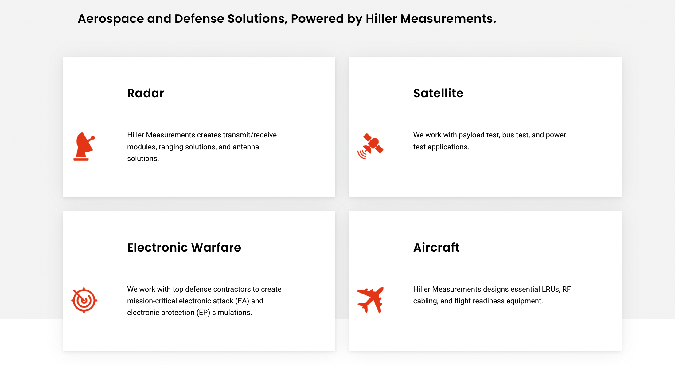
Instead of using bullet points in a web page, create an icon section instead. This section on Hiller Measurements’ website could have just been a bulleted list. Instead, icons and graphics make this section organized and engaging.
9. Always optimize IMAGES for search
This is an easy step to skip, but you’ll only be holding yourself back from potential organic search traffic by not optimizing images for search.
Don’t fall into that trap, because optimized images will display prominently in Google image searches, which can bring new visitors to your site. Companies who optimize their images for search experience a bump in visits – in some cases seeing between 20% and 60% of new visits coming from Google image search.
Here’s some best practices for optimizing your images for SEO:
Use relevant keywords in image file names. Be sure to avoid nonsensical image names such as the typical file names for stock photos – just rename them meaningfully.
Keep the file name to five words or less, and use a hyphen (-) between words without spaces.
Make sure each image is tagged with image alt text, and be sure to incorporate keywords in image alt text as well. Alt text should be around five words.
Place all images in the same sub-directory on your web server, because images that live in multiple directories will be more difficult for search engines to find.
Don’t use images with huge file sizes. This slows down your site which impacts how your website ranks in search.
Smart use of imagery online is both an art and a science. It requires time and thought to pull off. If you lack an in-house graphics department to assist you in making your website a piece of art, contact us to learn more about our web design services.


