
HOW TO CREATE A COHESIVE BRAND IDENTITY
Building a brand is all about building trust. To build trust, your company must build a cohesive and consistent brand. As you consistently message and present cohesive branded content to your target audience, you'll build brand trust.
Research from Lucidpress found the consistent presentation of a brand can lead to a 33% increase in revenue. Brands with inconsistent logos, colors, fonts and messaging give users the impression that they cannot be trusted and negatively impact your company's image.
To help you build a cohesive brand, here are six elements of a cohesive brand identity.
6 ELEMENTS OF A COHESIVE BRAND IDENTITY
1. Logo
Your corporate logo is the face of your company and should have a primary role in your marketing, sales, and company content. Your logo should reflect your brand and resonate with your buyers.
A successful brand can be identified without a logo, company name, or tagline. For example, Doritos launched an ad campaign that didn't feature a logo or brand name but was easily identified as a Doritos ad.
Why did Doritos choose to create a campaign without a logo? One, they wanted to appeal to younger consumers who are sick and tired of branding being forced down their throats. As a popular and established brand, Doritos had confidence its brand identity would continue to attract its target audience without its recognizable logo.
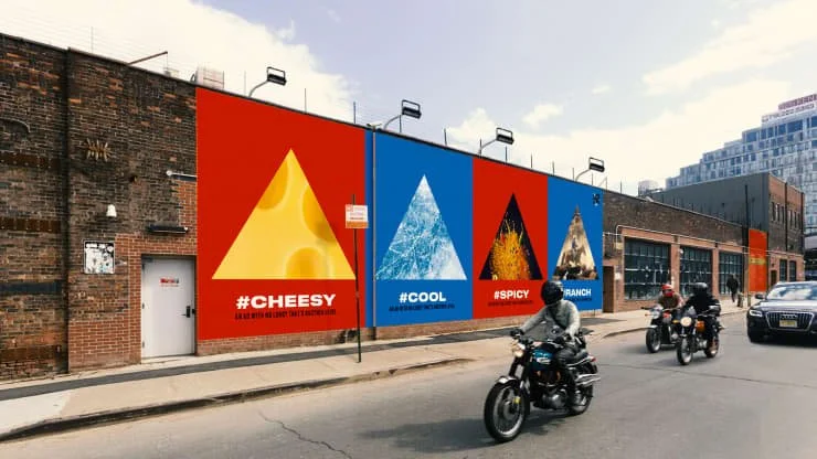
Doritos went without any core branding elements in this ad campaign.
2. Brand Colors
As a designer, brand colors are as important to me as a logo. It may seem easy to pick out brand colors, but I've had some branding projects where color selection was more challenging than selecting a final logo.
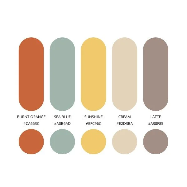
Here's a retro color palette that I love because the colors balance each other and come together for a great retro theme.
Start by picking the main brand color and then select complimentary colors to accent it. You'll want a pop of color, and also a neutral color to tone down your brand colors. I often use Pinterest to find color palettes I love. I also use Coolors.com and Adobe's Color Wheel tool when building brand colors for clients.
Be sure to take brand color selection seriously. Your colors are an easy way for people to identify your brand. If you routinely change or add random colors to brand collateral, you'll ruin the cohesiveness of your brand and may even confuse your target audience.
3. Brand Fonts
Selecting a brand font is important to building a cohesive brand. Every piece of marketing and business materials should use your brand font to help build consistency.
You should make sure that your brand fonts all go together. Header fonts should be bolder, while paragraph fonts should be easier to read.
San Serif
Header Font
Paragraph Font
Web Font
4. Icons
From the images and icons on your website to social media posts, your brand should be reflected and consistent in all your marketing imagery. If you decide to go with icons to showcase your company's services, then use your brand colors in these icons and consistently use the selected icons across branded marketing collateral.
For clients with unique products or services, it can be hard to find icons that capture your brand on icon sites. Think about hiring a designer to create custom icons for you. You can use custom icons in place of a product logo.
Your icons should go along with your brand style. If your logo features circle, then use a circle behind your icon to stay on brand. If your brand is minimalistic, then don't keep your icon simple and minimal. Below are example of how an icon can be styled to fit your brand aesthetic.

Here's an example of how an icon can be styled to meet your brand aesthetic.
5. Images/Illustrations
Brands need images that capture what they do or showcase their target audience. Ideally you can take your own photos of your employees and/or customers.
But capturing custom photography may not always be possible. You also can choose to buy stock photos. More recently, brands have started using graphics and illustrations in place of images. Graphics and illustrations used as branded visual imagery can help depict concepts that can't be captured in a single photograph.
When selecting brand imagery, be sure to find visuals that capture your industry in a unique way. There's a lot of brand imagery that is overplayed and fails to capture what makes a brand unique.
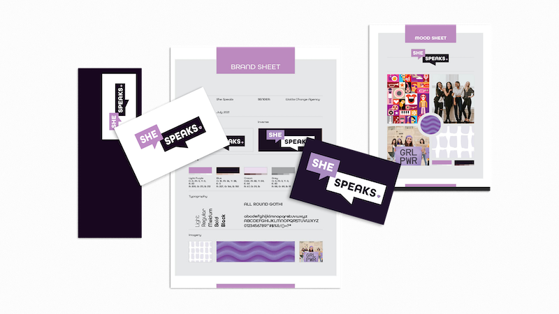
Here's a brand visual that I designed for TREW Marketing that captures the technical and engineering industry that TREW serves.
6. Shapes + Patterns
Another way to stay on brand is to use consistent shapes and patterns throughout your branded material. If your logo is a square, you can use squares in social graphics and as elements on branded marketing materials to echo your overall brand. These elements are useful in making the look of your design more cohesive and add some variety to your design.
You might use brand shapes in:
Social graphics
Icons
Page number elements
Cover images
Background images
Below is a custom brand pattern that I created for TREW Marketing. TREW’s whole website used electronic board patterns to show that they are a technical marketing agency. When I designed TREW’s website, we had trouble finding stock images that showcased technical marketing, so we chose to use a brand pattern instead. This pattern is designed with mostly circles and lines carefully balanced together.


Here’s a custom brand pattern that I created for TREW Marketing that helps showcase their expertise in technical marketing.