
How to Choose the Right Brand Color Palette
6 best practices for Selecting your Brand colors
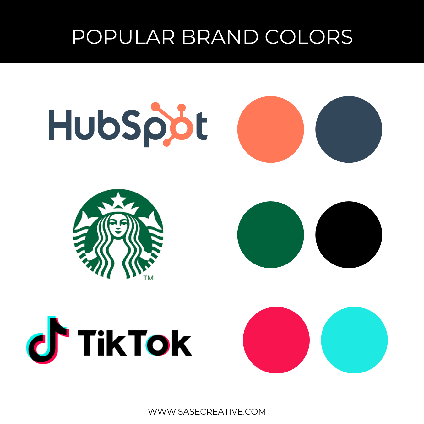
Colors matter when it comes to branding. Research shows that choosing brand colors wisely can impact how people perceive your brand. In fact, using a signature color can increase brand recognition and trust.

Malcolm Gladwell’s bestselling book, Blink, talks about how quickly perceptions and decisions are made in our brains. Gladwell’s research shows that slight changes, additions, and tweaks to brand packaging changed how people reacted and tasted products.
Check out some of the most interesting findings from Gladwell’s studies:
If you add 15% more yellow to the green of a 7UP packaging, people reported that it had more lime or lemon flavor – even though the drink had not been changed.
On a can of Chef Boyardee Ravioli, a picture of a close-up of a real human face influences perceived quality more than a full body shot or a cartoon character.
In the Hormel logo, adding a sprig of parsley between the ‘r’ and ‘m’ causes customers to perceive the products as being fresh.
This research shows that choosing the right color scheme for your brand and website is important. Your brand colors can influence how your audience perceives your brand and affects their emotions and behavior toward your business.
It's essential to make sure you choose the right color scheme that best represents your brand's personality and values.
Below, we'll go over six best practices for choosing the right color scheme for your brand and website. We’ll also show you some brand color palettes to give you some inspiration.
1. identify your brand's personality and values
The first step in choosing the right color scheme is to identify your brand's personality and values. Your brand's personality reflects your brand's character, tone, and values. These attributes should all be reflected in your brand colors.
For instance, if your brand's personality is warm and friendly, you can choose warm colors like orange, yellow, and red. If your brand is more conservative, then you might stick to a more monochromatic color scheme.

BRAND COLOR EXAMPLE:
Watts Change Agency
When it came to selecting brand colors, Watts Change Agency wanted bright colors that showed symbolized change and growth. We picked out a bright color scheme and used neon green for a modern take on growth and change.
You can read the full case study on Watts Change Agency here.
2. Consider your target audience
Your target audience plays a significant role in choosing the right color scheme. You need to understand their preferences and emotions toward colors.
If your target audience is predominantly male, you may want to choose more masculine colors like blue or black. On the other hand, if your target audience is predominantly female, you may want to choose more feminine colors like pink or purple. Colors also might change based off the industry you’re in. Blue is a color of security so many banks and security brands have blue in their brand colors.

Be sure to think about your audience when picking out colors. A construction worker is not likely to want a pink and purple color palette for their brand. Download this buyer persona worksheet to learn more.
3. Choose a Modern color scheme
Colors schemes come and go. When it comes to brand colors, you want to select a modern color scheme, but you don’t want to just pick trendy colors. Your visual branding should stand the test of time.
Contemporary color schemes often feature unconventional color pairings that add interest and excitement to your brand. Don't be afraid to try new and unexpected color combinations.

4. Use color psychology to your advantage
Colors can influence emotions and behaviors. That’s why it's important to use color psychology to your advantage.
For instance, blue represents trust and security, while red represents excitement and passion. Choose colors that reflect your brand's values and personality to evoke the desired emotions from your target audience.
Use the chart on the left to better understand what each color represents.
5. Keep it simple
When it comes to color schemes, less is always more. Too many colors can be overwhelming and confuse your audience. Stick to a maximum of three to four colors to maintain simplicity and consistency.
Using a simple color palette can help maintain simplicity and consistency in several ways:
Clarity: A limited color palette can help to clarify the message you are trying to convey. When there are too many colors, it can be confusing and distracting to the eye. By limiting your brand colors to 3-4 colors, you can ensure that the colors you choose are easily recognizable and associated with your brand or message.
Consistency: A limited color palette can help ensure consistency across all of your branding and design materials. By using the same colors in different applications, you can establish a consistent look and feel, which can help to build brand recognition and trust.
Efficiency: By limiting the number of colors, you can streamline the design process and reduce the time and effort needed to create new materials. Plus, printing and embroidery costs can add up with more colors.
6. Test and iterate
Once you have chosen a color scheme, test it on your website and see how it resonates with your target audience. If it doesn't work, iterate until you find a color scheme that works for your brand.
I often have small businesses that come to me just to help me refresh their color schemes. Sometimes you just need to tweak some of your brand colors to give your brand identity a small refresh. As colors come in and out of fashion, your brand can make small changes to brand colors to reflect the times.
Here are five of our favorite brand color palettes to inspire you:

This color scheme shows you can use red, white, and blue without looking completely patriotic. These natural and warm colors feel really authentic for a brand.

This color scheme shows you can use red and green without conjuring up Christmas. This color scheme is natural and bright. The neon green color is popular now and would be great to use on CTA buttons.

Is it purple? Or is it pink? Neither, it’s maroon and this color is gaining a lot of popularity right now. This monochromatic color scheme is moody and feminine. This would be a great color palette for a beauty consultant or life coach.
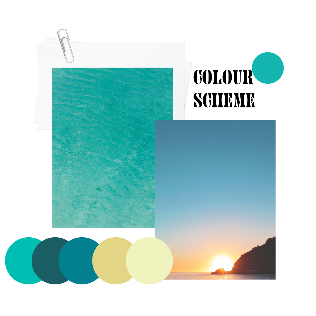
This color scheme looks like a summer day by the water. We can feel the calm of the sea and the energy of the sun when we look at this color palette. This color scheme would work well for an organic lifestyle brand.
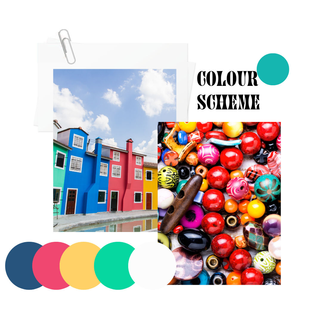
This color palette gives a lot of energy and pop. These colors are modern and timeless. I could see this color palette being used for an education brand, or even a manufacturing or construction brand.
Choosing the right color scheme for your brand and website is essential in building your brand’s presence. By identifying your brand's personality and values, understanding your target audience's preferences, choosing colors that complement your logo, using color psychology to your advantage, keeping it simple, and testing and iterating, you can choose a color scheme that best represents your brand and appeals to your target audience.
Here’s a free brand planning workbook to help you strategize your visual branding. Download this free brand planning workbook by clicking the button below.
Interested in working with us to develop your visual brand identity? Contact us today to get started on a brand design project with SASE Creative.